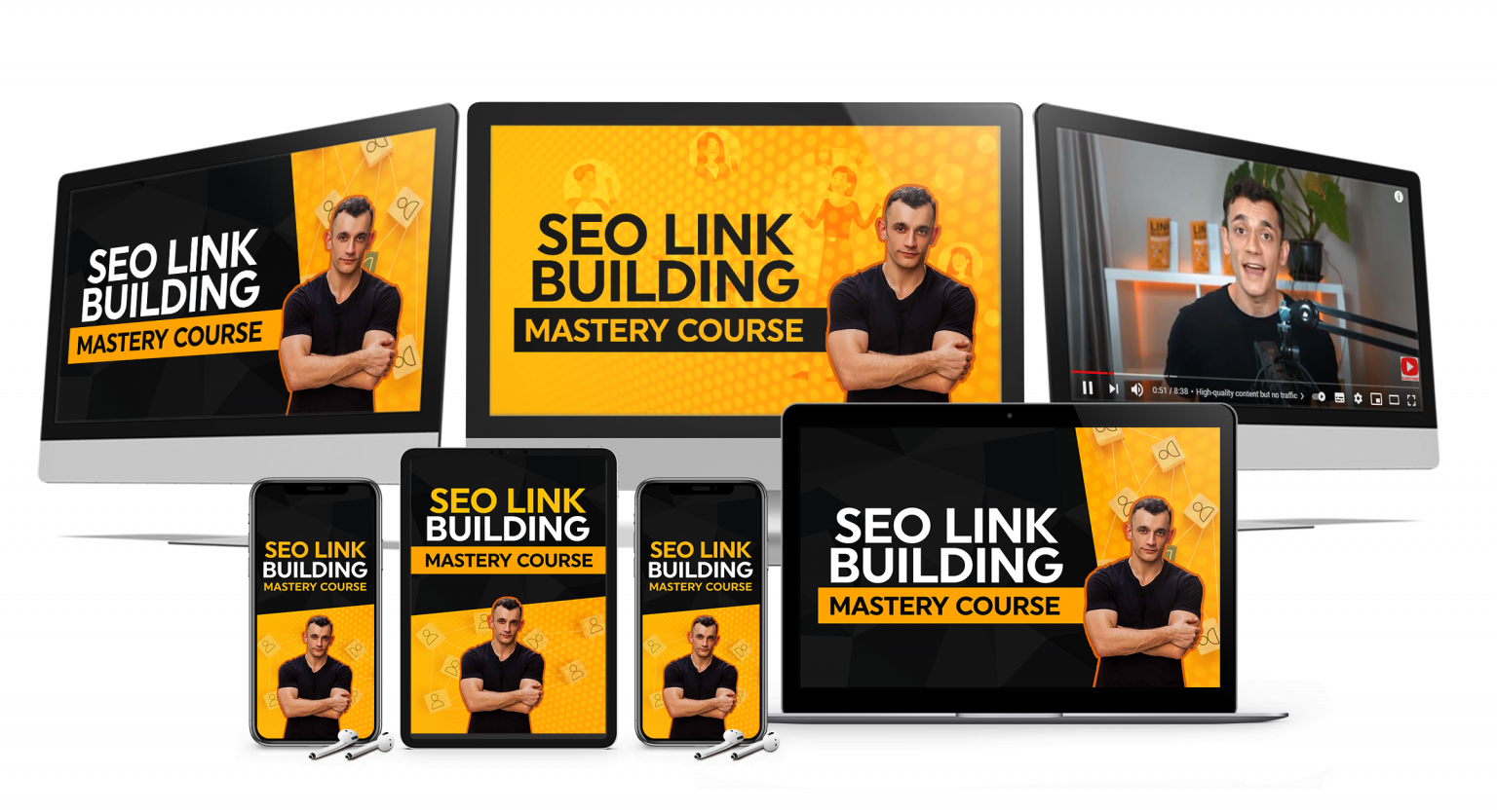
Claude Design pitch deck is quickly becoming one of the smartest ways to turn messy ideas into something clear, polished, and ready to show clients, investors, or leads.
Most people will still waste hours rewriting slides, fixing layouts, and trying to make their presentation look professional when Claude can now handle a huge part of that work for you.
If you want to turn tools like this into real systems for growth, take a look at AI Profit Boardroom.
Watch the video below:
Want to make money and save time with AI? Get AI Coaching, Support & Courses
👉 https://www.skool.com/ai-profit-lab-7462/about
Claude Design Pitch Deck Results Start With Better Inputs
The biggest mistake people make with a Claude Design pitch deck is treating it like a normal presentation tool.
It is not just a place to drop text onto slides and hope everything somehow looks decent.
Claude Design is much stronger when you give it context, structure, audience intent, and the actual outcome you want from the deck.
That means you should not start with a vague prompt and expect a polished result.
You need to tell it who the presentation is for, what offer you are showing, what pain point matters, how many slides you want, and what action the viewer should take at the end.
A better prompt creates a better first draft.
That matters because the first version shapes everything that comes after it.
If Claude starts from a vague prompt, you end up spending your time fixing confusion instead of improving a strong draft.
Once you feed it the right angle, the whole process gets faster.
That is where the real leverage begins.
A Claude Design Pitch Deck Works Best When The Story Comes First
Most weak presentations do not fail because the design is ugly.
They fail because the story is flat.
The slides may look clean, but nothing connects.
There is no tension.
There is no clear problem.
There is no reason for the person watching to care enough to keep going.
A Claude Design pitch deck gets much better when you build the story first and let the design support it.
That usually means starting with a hook, then showing the pain, then the cost of ignoring the problem, then the shift, then the solution, then proof, then the offer, and finally the call to action.
That structure works because it gives the presentation motion.
Instead of looking like a bunch of disconnected slides, it feels like one argument moving forward.
Claude is very good at following that direction when you tell it what each slide needs to do emotionally and logically.
You can ask for one slide to create urgency, another to simplify the offer, and another to remove doubt.
That is a much better use of AI than asking it to just make it pretty.
Design matters.
But design without narrative still loses.
Claude Design Pitch Deck Speed Becomes A Huge Advantage
This is where the tool starts getting interesting for business owners.
A normal deck can take hours or even days when you are doing the writing, layout, structure, and revisions manually.
That time adds up fast, especially if you build sales decks, webinar decks, investor decks, workshop decks, or internal proposal decks every month.
Claude Design compresses a lot of that work.
Instead of starting from a blank screen every time, you can generate a full direction much faster and improve it from there.
That matters because you are not stuck with one output.
You can refine the layout, adjust sections, change visual hierarchy, and keep pushing the deck toward the result you want.
Instead of restarting from scratch every time, you work from momentum.
That one change alone can save a ridiculous amount of effort.
If you build client presentations, that means faster turnaround.
If you sell services, that means faster testing.
If you pitch offers often, that means you can try more angles in less time.
And when you can test more angles, you learn faster.
That is usually where the money is.
Slide Flow Inside Claude Design Pitch Decks Needs Less Fluff
Most pitch decks are too long because people are scared to be clear.
They hide weak thinking behind extra slides, filler phrases, vague claims, and recycled business language.
That is why so many decks feel heavy even when they only have ten slides.
Claude can help cut that down if you use it properly.
A strong Claude Design pitch deck usually gets better when every slide has one job.
One slide should hook attention.
Another should frame the problem.
A later one should explain the mechanism.
Another should show proof.
A final one should make the next step obvious.
That simple rule keeps the deck clean.
It also makes editing easier because you are not trying to force five ideas into one screen.
When a slide has one job, Claude has a clearer target.
That usually means stronger copy, cleaner layouts, and fewer revisions.
The result feels sharper because it is sharper.
People often think they need more content to make a presentation convincing.
Usually they need less content and better sequencing.
If you want better examples of how to turn simple AI tools into usable sales assets, AI Profit Boardroom is a good place to study that properly.
Claude Design Pitch Deck Quality Improves With Visual Direction
A lot of people still assume AI design tools fail because they cannot think like designers.
That becomes much less true when the prompt includes clear visual intent.
You might know you want a deck to feel bold, minimal, premium, modern, or trustworthy, but those words can still mean different things to different tools.
Reference material tightens the gap.
When you pair that with clear copy direction, the output gets better fast.
You can also tell Claude what visual feeling should match the audience.
A pitch deck for local service businesses should not look like a crypto conference keynote.
A deck for enterprise buyers should not feel like it was made in a rush with no buyer awareness.
The tone needs to match the buyer.
That is where context beats templates.
Templates are static.
Context adapts.
And adaptation is what makes the deck feel custom instead of generic.
Claude Design Pitch Deck Workflows Get Stronger With Connected Assets
One of the most useful parts of this kind of workflow is that the deck does not have to stay trapped as a mockup.
You can use the presentation to clarify the message, map the structure, validate the offer, and then carry that same direction into landing pages, sales pages, or demos.
That is a much smarter way to work.
Instead of treating the pitch deck as a final document, you treat it as a decision-making asset.
Once the offer is clear in the slides, the rest of the marketing usually becomes easier.
The landing page gets easier.
The sales call gets easier.
The onboarding message gets easier.
The follow-up email gets easier.
Everything starts to line up because the messaging got sharpened at the deck stage.
That is a big reason this kind of workflow matters.
You are not just saving design time.
You are improving clarity across the whole business.
Claude Design Pitch Deck Prompts Should Match The Real Audience
One of the fastest ways to ruin a good deck is writing it for yourself instead of the audience.
You know too much.
You know the offer.
You know the jargon.
You know the backstory.
The buyer does not.
That gap is exactly why many decks feel confusing even when the founder thinks they are obvious.
A Claude Design pitch deck becomes far more persuasive when the prompt names the audience clearly.
Say whether the deck is for small business owners, startup investors, agency leads, SaaS founders, consultants, or local service operators.
Then tell Claude what that audience already believes, what they are skeptical about, and what they actually want.
That changes the whole tone.
It changes the examples.
It changes the complexity.
It changes how aggressive or calm the slides should feel.
The best decks do not just explain.
They translate.
That is what you want Claude to help you do.
And when you get that part right, the presentation stops sounding smart and starts becoming useful.
That is a big difference.
Claude Design Pitch Deck Use Cases Go Beyond Investor Slides
A lot of people hear pitch deck and think only about startups asking for money.
That is too narrow.
You can use a Claude Design pitch deck for sales calls, client proposals, service offers, internal strategy decks, workshop presentations, training assets, and partnership outreach.
That makes it much more practical than people first assume.
A consultant can use it to package an offer more clearly.
An agency can use it to make proposals feel more premium.
A creator can use it to turn a messy offer into a clean visual story.
A software founder can use it to explain product value before building every feature.
A team lead can use it to align people around one direction.
That versatility matters because it increases how often the tool can save time.
You are not just learning one gimmick.
You are learning a format that helps you sell ideas over and over again.
The more often you need to explain something important, the more useful this becomes.
That is one reason tools like this are getting attention so quickly.
They are not only for designers.
They are for anyone who needs clarity at speed.
Claude Design Pitch Deck Execution Beats Fancy Theory
Most people do not need another abstract lesson on storytelling.
They need a simple workflow they can actually use.
The easiest way to get value from a Claude Design pitch deck is to keep the process tight.
Start with the audience.
Add the problem.
State the offer.
Map the slide sequence.
Set the tone.
Ask for the first draft.
Then edit hard.
Trim weak words.
Simplify cluttered slides.
Strengthen the headline on every important section.
Make the call to action painfully clear.
Then test the deck in the real world.
A deck is not good because it looks polished in your browser.
It is good because it moves someone.
It gets them to reply.
It gets them to book.
It gets them to buy.
It gets them to say yes.
That is the standard that matters.
The people getting real results from AI tools are usually the ones who use them to produce more reps, more tests, and more feedback.
That is where the edge comes from.
If you want a faster path for building real workflows around this, AI Profit Boardroom is worth checking before you move into the FAQ section.
Frequently Asked Questions About Claude Design Pitch Deck
- Is Claude Design pitch deck good for beginners?
Yes, it is much easier for beginners when they already know the audience, the offer, and the goal of the presentation. - Can Claude Design pitch deck help with sales presentations?
Yes, it can be very useful for sales decks because it helps structure the message and improve the visual flow faster. - Does Claude Design pitch deck only work for startup fundraising?
No, it also works for client proposals, workshop decks, service offers, training slides, and internal presentations. - What makes a Claude Design pitch deck better than a normal slide deck?
The biggest difference is speed, iteration, and the ability to shape both the message and the design together in one workflow. - What should I include in my prompt for a Claude Design pitch deck?
The best prompt usually includes the audience, the offer, the pain point, the number of slides, the tone, and the final call to action.